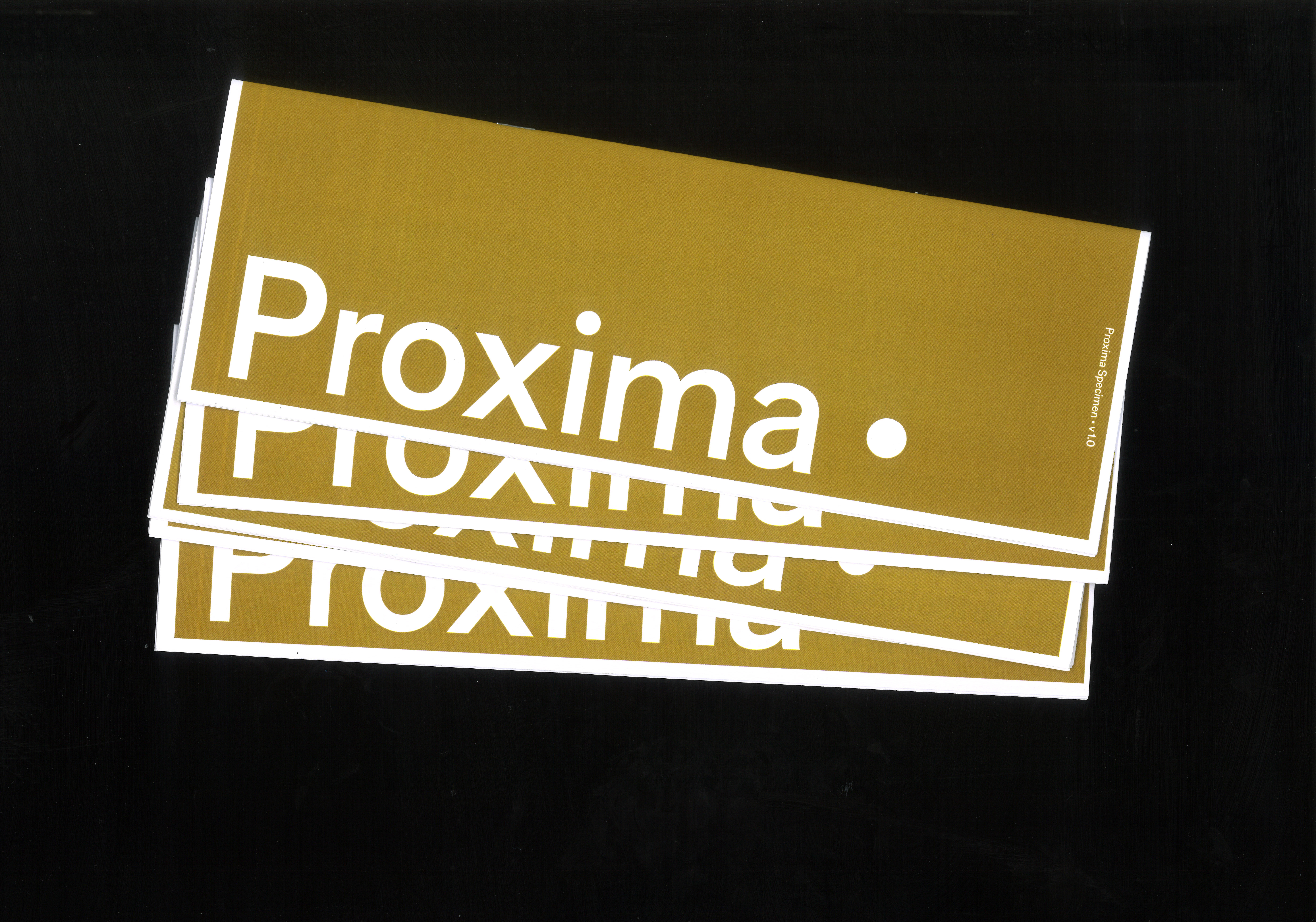
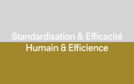
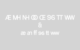
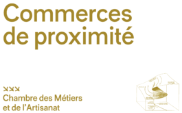
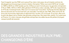
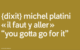
«Style means adapting functional forms and forms of representation to the spirit [...] of the time.» Starting from this quote by Karl Gerstner, I questioned the relevance of the excessive use of Helvetica and other Swiss sans fonts in our contemporary world. Indeed, these characters carry with them the hopes and unlimited growth of a post-war world where progress and technology reigned. In this former world, attention was focused on economic growth, which also widened social inequalities, whereas today humans have a much more important place. Therefore, it is no longer efficacy that prevails but efficiency. This is the transition that I wanted to reflect with Proxima.
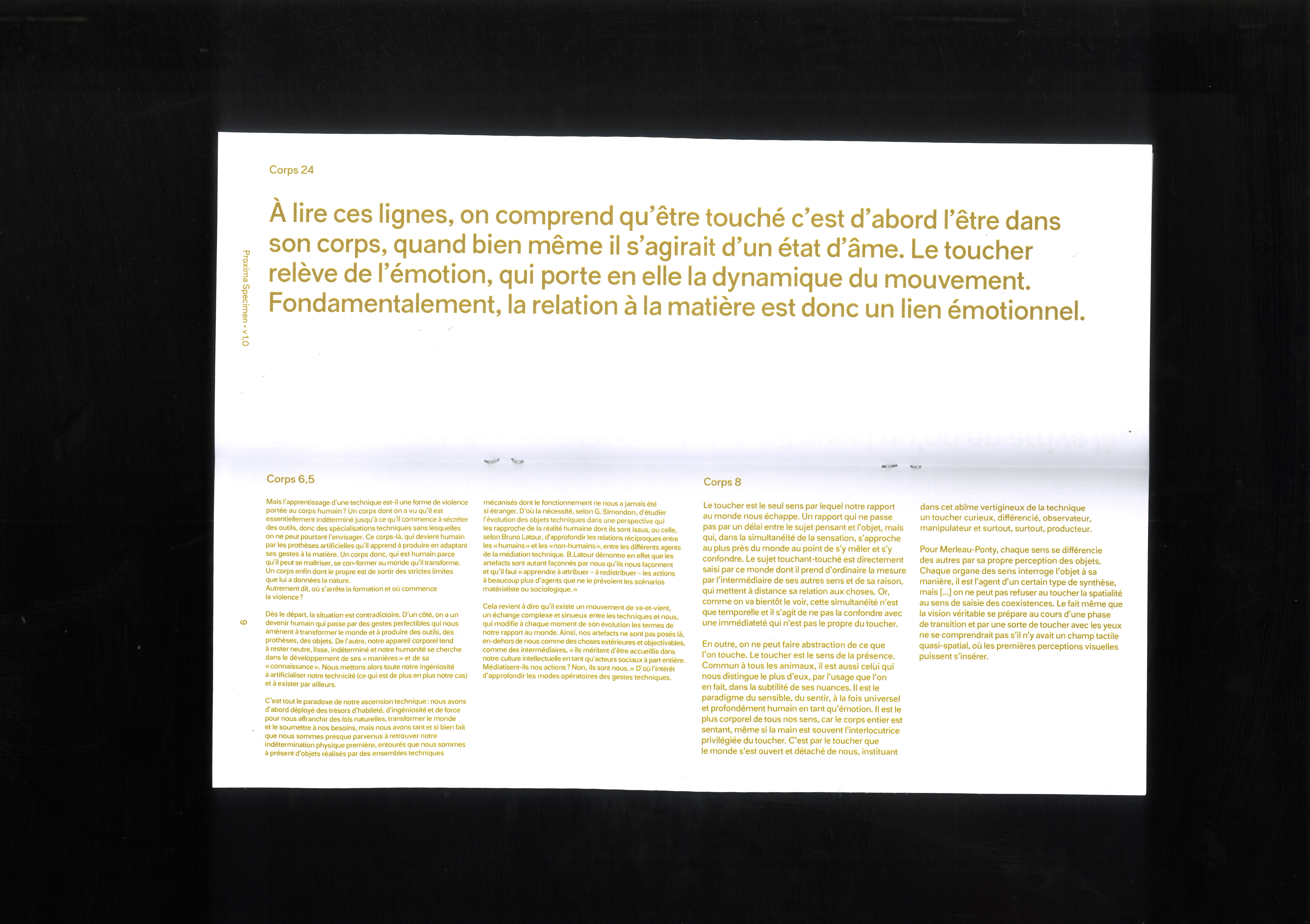
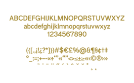
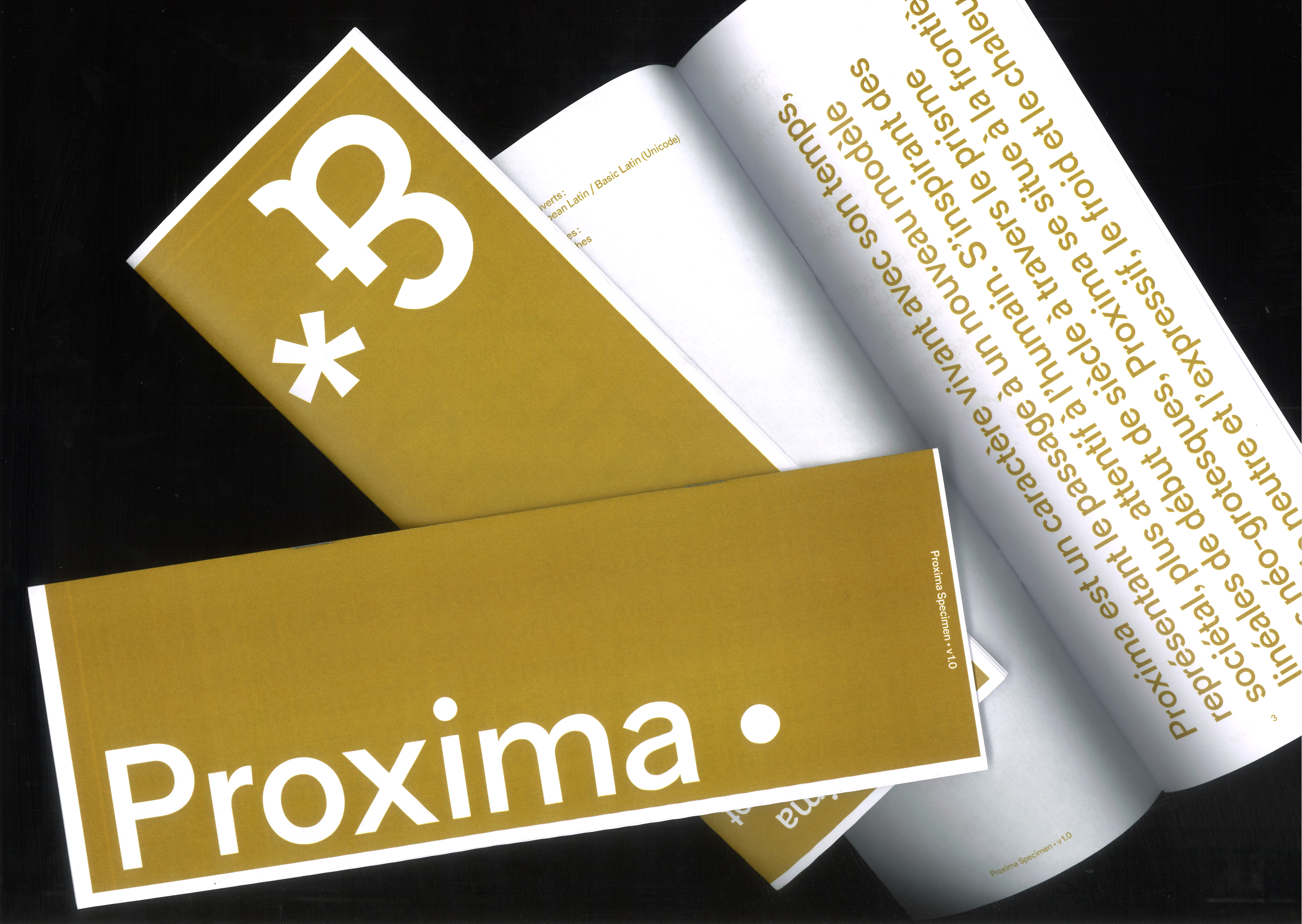
Proxima is a typeface living within its time, representing the transition to a new societal model, a model more attentive to humans. Drawing inspiration from early century grotesque fonts through the prism of neo-grotesques, Proxima is at the bounds between neutral and expressive, cold and warm. It is composed of one style, with 572 glyphs covering the basic Latin languages. This is a first draft, the font is still in progress, see you in five years.
Download specimen here.
Proxima

Type Design
2023


«Style means adapting functional forms and forms of representation to the spirit [...] of the time.» Starting from this quote by Karl Gerstner, I questioned the relevance of the excessive use of Helvetica and other Swiss sans fonts in our contemporary world. Indeed, these characters carry with them the hopes and unlimited growth of a post-war world where progress and technology reigned. In this former world, attention was focused on economic growth, which also widened social inequalities, whereas today humans have a much more important place. Therefore, it is no longer efficacy that prevails but efficiency. This is the transition that I wanted to reflect with Proxima. See more…
Proxima is a typeface living within its time, representing the transition to a new societal model, a model more attentive to humans. Drawing inspiration from early century grotesque fonts through the prism of neo-grotesques, Proxima is at the bounds between neutral and expressive, cold and warm. It is composed of one style, with 572 glyphs covering the basic Latin languages. This is a first draft, the font is still in progress, see you in five years.
Download specimen here.
Type Design
Proxima
2023
